
IOS & Android App Experince | Duration 11 weeks
Overview
Our Victoria’s Secret past records say that 41% of our revenue is generated from marketing platforms such as SMS, Gmail, Push Notification, and Social Media Ads. Our brand owns a huge number of marketable users, approximately around 11.7 million customers from M-web and the app, who are actively engaged on marketing platforms for real-time updates and get benefits through these channels. Through this, Victoria’s Secret is building revenue of approximately 1–1.5 million regularly with our marketing channels, mostly from SMS, Email, Social Media Ads, and Push Notifications.
Our M-web & App customers engagement data on marketing platfrom are


Our Challenges
Overall, we have 12.8M marketable customers on our app who actively engage with the native/mobile platform for purchases. However, only 11.1% of these customers have opted in for push notifications, while 88% skip them during app launch and throughout the shopping journey. This low opt-in rate directly impacts brand awareness, as a majority of users miss out on timely updates, ongoing promotions, and key trends.
88% of our customer segment skips opting in for push notifications are

74%
Unrecognized Customers

Anonymous or Guest Customers
Inactive Customers
14%
Recognized Customers

Active
Customers
Logged in Customers
New
Customers
How are our customer segments being affected?
With only a small percentage of customers opting in for push notifications, a large segment of users, especially anonymous and first-time visitors, remain disconnected from timely brand updates. These users often miss out on product launches, seasonal offers, and exclusive membership benefits, which directly impacts engagement and repeat purchases.
Data shows that opted-in users are more likely to revisit the app within 3 to 5 days, while non-opted users exhibit longer inactivity periods and lower conversion rates.
This communication gap also reduces brand recall and the opportunity to deliver personalized experiences, ultimately limiting overall business growth.
⬇️ Low Opt-in affect
🔗❌
Creating a gap between customers & the brand
👤🔒
Limits the opportunity to deliver personalized experiences
💭❌
Reduces brand recall
💰❌
Constrains overall business growth & engagement

Where are we
Lacking in the existing experience?

Our Data says only 3.8% of marketable users purchased through this existing design

Existing customer journey flow for opting push notification

Key observations on the existing design & customer journey

What our customers say on the notifications page

We conducted customer research interviews on the onboarding experience of Victoria’s Secret, where we gathered insights related to push notifications. During these interviews, I gained key insights from customers who had skipped opting for push notifications and shared their reasons for doing so.


Our re-defined problems
🚫
Poor timing & high friction
The prompt appears too early in the user experience, leading customers to decline the opt-in
🌀
Vague Value Proposition
The UX copy feels weak, and the message is focused only on the current (generic) segment
🕹️
Lack of User Control
Feasibility to get out of notifications at any given time not on settings page
Design approach
its impact

What are the best practices
This study focuses on competitive benchmarking to understand how others are performing in terms of push notification nudges, along with secondary research where we gained insights into the UX guidelines recommended by experts to address the identified problems.
Existing customer journey flow for opting push notification
Key Insights from Patterning
Common patterns are to request push notification opt-ins at app launch, leveraging user attention when engagement is highest.
Most brands emphasize the benefits of opting in, increasing consent rates by showing users what they gain.
Some brands guide users on how to manage or opt out, reducing hesitation and fostering trust.

Opt-out from notification
Key Insights from Patterning
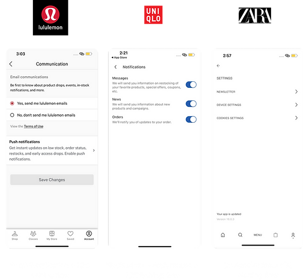
Some brands, like Lululemon, group all marketing communications (email + push notifications) under one setting for simplicity.
Some apps, like Uniqlo allow users to customize what types of notifications they want to receive, offering more control and personalization.
Apps without in-app controls send users directly to the native iOS settings to manage notifications.
Our Experts Recommnadations
Shifting from Interruption to Value Exchange


*In 2016, the average mobile phone user received 56 notifications per day according to a study from Telefonica Research in Spain [Pielot 2018].
Consistency, Information Scent, Context, and Minimum Friction.


Data that supports a strong decision to redesign our existing push notifications.
KEY LEARNINGS
Treat the push notification permission request as a Value Exchange, not a demand.
Actionalble Takeways
Never ask users to opt-in with a generic message. Instead, delay the prompt until a High-Value Moment (like when they wishlist an item) and use a "Soft-Ask" to clearly explain the specific, personal benefit they will receive. The notification must serve the user's goal, not the company's.
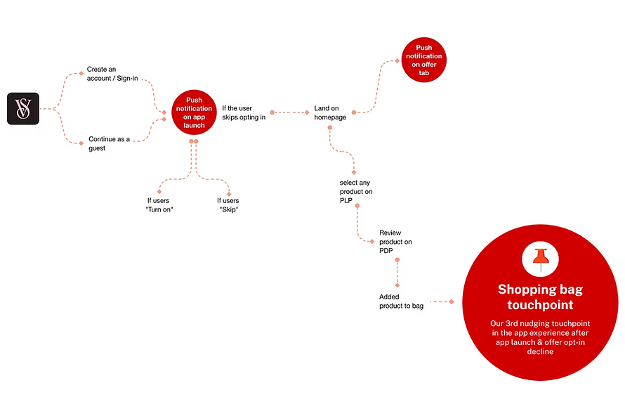
Our proposed 3 major nudging touchpoints for push notifications
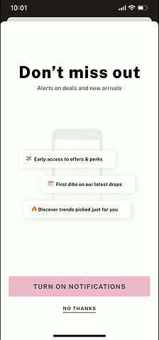
First nudging touchpoint: App Launch


Push notfification touchpoint
Our first nudging touchpoint in the app experience
If users
"Turn on"

If users
"Skip"
Homepage
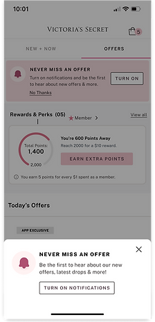
Renudging users on offer page
Rationale for app launch nudge
21.6% of customer revenue is generated from app launch nudges with the existing design.
88% of customers who skipped are already aware of the touchpoints, making this a high-potential page for renudging with notifications that offer high value.
Most of our customers are nudged by push notifications during the app launch
At this point, customers notice the notification but skip it due lack of clarity
Use case Consideration
Customers who skipped the first time are renudged after 7 days at same place.
Customers who have not opted for push notification.
Customers who have opted earlier and opted out for push notification.
Second nudging touchpoint: Offer Page

Rationale for offer page nudge
Higher customer engagement on the Offer Page, as 73.9 % of customers visit it before making a purchase decision.
Returning users visit the app to check offers; hence, we can nudge them on the Offer Page with a message like “Get faster updates on product offers before they go out of stock.”
An opportunity to keep a nudge permanent on the Offer Page, as this page provides updates related to all brands. Users can visit the Offer Page anytime and opt in.
Use case Consideration
Customers who skipped it during the app launch can visit the Offer Page to opt in to notifications.
For customers who opt in during the app launch, the nudge will no longer be visible on the Offer Page.
The Offer Page nudge will be the same for all customers who have not opted in.
Third nudging touchpoint: Checkout page


Rationale for shopping bag nudge
The shopping bag page, being the final stage of the journey, is ideal for a contextual nudge
At this stage, customers may be interested in order or product updates, making it a potential place for the nudge
Use case Consideration
Only customers who skipped enabling notifications at app launch and on the offer page will see the nudge on the shopping bag
Proposed touchpoint for Notification Control


Notification Control on Settings Page
Flexible Touchpoints for Opting In or Out
Rationale for notification control
It builds trust and compliance by following platform and privacy standards such as App Store and GDPR policies
Encouraging long-term engagement, users are more likely to opt in when they know they can easily opt out later.
Providing user autonomy allows customers to manage their notification preferences anytime, ensuring transparency and control.
Use case Consideration
First-time opt-in users should be able to revisit settings easily to enable notifications again.
If users skip all nudges, they can opt in for notifications from the Settings page
A consistent place to opt in for notifications anytime
Cross-Pod Stakeholders Alignment for Notification Touchpoints
Collaborated with the Customer Pillar, Marketing Engagement, and Fulfillment teams, including:
-
Product Owners (POs)
-
Product Managers (PMs)
-
Design Teams
-
Tech Teams
-
Design Managers

The proposed touchpoints for the notification nudge to stakeholder are :
✅
App launch
Primarly nudging touschpoint for non opted users
✅
Offer page
2rd constant nudging touchpoint for opting
❌
Checkout Page
3rd nudging touchpoint for opting
✅
Settings Page
Flexible Touchpoints for Opting In or Out
*App Launch, Offer Page, and Settings Page touchpoints are aligned with our stakeholders, whereas the Checkout Page touchpoint is deferred for now
❌
Checkout Page
Why have Fulfillment stakeholders currently deferred the Checkout page touchpoint?
The Fulfillment team, including most participants, highlighted that the Checkout page already provides sufficient information. Adding a notification nudge here could distract users from completing their purchase, potentially leading to abandoned carts or lost sales. To mitigate this risk, Checkout is currently excluded as a notification touchpoint until the checkout experience is restructured.
Nudge Design Ideation Across Touchpoints


Shortlisted design for App launch
Proposed design -1
Updated the UX copy to be relevant to the context.
Added interaction for better users experience.
Added a value proposition with visuals to make the experience feel more realistic for users.
Strengths
Value proposition is seamlessly integrated with visuals for quick scanning.
Well-structured information hierarchy ensures all key details are effectively communicated.
Consideration
Define clear animation rules for timing, smoothness, and trigger conditions.
iOS developers can implement simpler micro-interactions natively with Figma.
Android has stricter constraints and relies on Lottie files for animations.
Proposed design -1

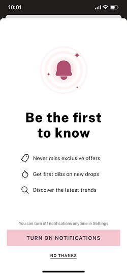
Rewritten header to evoke exclusivity
Added iconography (bell) to instantly convey notification context
Simplified layout with increased white space for a premium, focused experience.
Strengths
Minimal distractions; keeps attention on CTA and core message.
Clean visual hierarchy with ample white space ensures easy readability and focus
Balanced use of iconography (bell) instantly conveys purpose and builds recognition.
Consideration
Use subtle motion carefully, and avoid drawing focus away from CTA
Maintain consistent icon and typography style across iOS and Android
Proposed design -3

Updated the UX copy to be relevant to the context.
Added interaction for better users experience.
Added a value proposition with visuals to make the experience feel more realistic for users.
Strengths
Humanizes the experience through relatable imagery and friendly copy.
Consideration
Ensure illustration doesn’t overpower text hierarchy.
Optimize image load time and maintain balance between visual and copy weight.

Our Preference
Why we preferred middle option
Design Excellence:
User-Centric Approach:
The screen combines design excellence with a clean, on-brand, visually engaging layout.
It follows a user-centric approach, highlighting benefits, providing clear choices, and building trust before the OS prompt.
Tech Simplicity:
It ensures tech simplicity with a lightweight, reusable, backend-free setup for quick, cross-platform deployment.
Shortlisted design for offer page
Proposed design -1

Clear CTA to enable the notification
No thanks for users who would not be interested to see this banner and focus on Offers
Banner for enabling the notification for users who’d be interested in Offers related notifications
Strengths
The Banner positioned at the top, ensuring visibility without disrupting the user’s browsing experience.
Low dev. effort for both types of users (Existing & Anonymous)
The user has the control to remove this banner if they're not interested.
Consideration
Set clear rules for animation like timing, smoothness, and when it should play.
IOS developers could code simpler micro-interactions natively with figma, android is rigid with Lottie files.
Proposed design -2

Reinforces the same message at a deeper engagement point
Strengths
Nudging when users are already exploring offers, increasing opt-in intent.
Bottom sheet keeps the page visible, maintaining browsing flow
Fixed position captures attention without feeling forced
Consideration
Avoid showing too frequently to prevent banner fatigue
Test placement timing — after brief page engagement (2–3 sec).
Irritating for users who decline during app launch
Our Preference
Why we preferred first option
Design Excellence:
The top banner maintains a non-intrusive presence, clear focus with bold title and outlined CTA, and aesthetic consistency with pink tones and clean typography.
User-Centric Approach:
The banner offers perfect contextual timing on the "OFFERS" tab, low friction by letting users scroll, and a soft decline with an easy "No Thanks" link.
Tech Simplicity:
The fixed-position banner is easy to deploy with low development effort, requires no complex state management, and ensures high performance with instant loading and smooth scrolling.
Shortlisted design for setting page
Proposed design -1

Enhanced UX copy and added value proposition
Strengths
An effortless opt-out process is integrated into the account page without major difference or change
Integrated value proposition to retain customers who want to opt out.
If users decline the App Launch and Offer nudges, they still have the opportunity to opt in through this final nudge
Consideration
Nudge arrow redirects users to iOS setting page from app which misght discomfort the users
Proposed design -2

Added toggle to switch off the notification faster
Strengths
An effortless opt-out process is integrated into the account page without major difference or change
Integrated a toggle which states the active status of push notification
If users decline the App Launch and Offer nudges, they still have the opportunity to opt in through this final nudge
Consideration
Challalnging to retain users without value preposition
Our Preference


Why we preferred first option
Design Excellence:
The design uses a standard link style for easy recognition, a clear title and subtitle for value, and logical grouping under SUPPORT for intuitive access.
User-Centric Approach:
Provides self-service control for users, intuitive placement in Settings for easy access, and educational value to reinforce feature benefits.
Tech Simplicity:
This link is easy to implement, provides a base for detailed notification settings, and is always accessible so users can manage preferences anytime.
Design review with Business leaders and stakeholders
App launch Page Nudge – Feedback & Key Takeaways

❌

❌
✅
Feedback:
Most stakeholders are aligned with the design and UX approach for Option 2, finding it visually balanced, clearly communicative of all benefits, and added subtle animations
Suggestion:
Added a note on the App Launch screen indicating that users can turn off notifications anytime in Settings, enhancing transparency and control.
Offer Page Nudge – Feedback & Key Takeaways

❌
✅
Feedback:
Most stakeholders are aligned with the design and UX approach for Option 1, finding it a subtle nudge for notifications while giving more space and priority to the listed offers.
Suggestion:
Reduce the banner height as it occupies too much space, and make the copy slightly shorter and more concise.
Setting Page Nudge – Feedback & Key Takeaways

❌
✅
Feedback:
Most stakeholders are aligned with the design and UX approach for Option 1, as this design aims to retain customers by highlighting the benefits of summaries to those who came to opt out of notifications.
Suggestion:
Validate design with the legal team.
Revised design after considering feedback
App launch
Proposed Design v.1
Revised Design v.2

Design Changes
Added a note to enhance transparency and reduce customer anxiety

Offer page
Second reminder for notifications that stays until the user removes it
Proposed Design v.1

Revised Design v.2

Design Changes
Added subtle animation and reduced the banner size and UX copy.

Setting page
Flexible touchpoints for opting in or out anytime
Proposed design v.1 (No design change)

Final designs & specifications


App launch Design Specification
If notifications were off, show the prompt after sign-in or sign-up.
If the user taps "Turn on Notifications," show the system popup or redirect to settings (popup preferred)
If the user selects "No Thanks," close the nudge and return to the homepage.
If the user dismisses the nudge, show it again after 7 days if notifications are still off.
If a user dismisses the nudge 3 times and keeps notifications off, stop showing it after the final re-prompt.


Offer page design specification
If push notifications are off, show the notification banner on the Offers page.
If the user taps "Turn on," show the system permission dialog or redirect to notification settings as per OS rules.
If the user clicks "X," remove the banner and don’t show it again on the Offers page.
If the user clicks “X” and revisits the Offers page after 4 days, show the banner again.
If the user enables push notifications, remove the banner and don’t show it again on the Offers page.


Account setting design specification
On the Account page, tapping "Push Notifications" shows the system permission dialog or redirects per OS rules.
Similar path for enabling/disabling notification
In non-English settings, "Push Notifications" and its subtext should be correctly translated.
Similar visual treatment for both VS & PINK
Similar approach for signout users or new users.
🚀
Launched this design initially to 10% of customers
12%
Increase in Customer Opt-In Rates
8%
Increase in revenue per visit.
19.7%
Decrease in notification declines
0.5%
Monthly Opt-Out Rates