Helping users discover products faster and with less effort.


About the company
Medikabazaar is an online B2B & B2C marketplace for medical supplies and equipment. We connect with more than 50,000 medical establishments 150,000 independent practitioners and have partnered with 13000+ suppliers all over India.
Problem Statement
Although 37% of customers purchase independently on our online platform, nearly 47% still rely on customer support for placing orders and obtaining detailed product information. This reflects a strong dependency on personalized assistance for a large user segment. However, high reliance on customer support can frustrate customers, impact their purchase decisions, and limit business growth, as a small support team cannot effectively handle a growing customer base.
Goal
Help more customers buy directly from the website by making product information clear and the process simple, so they don’t need customer support.


My role & responsibilities
As a designer for the entire project, my role, along with the design team, was to
-
Identify the gaps in the existing product through usability analysis
-
Framing the questions for user research and conducting user interviews with APM’s
-
Understanding user needs & expectations from research
-
Redesigning the shopping experience & adding new features
-
Reviewing with multiple stakeholder and improving design as per the feedback
-
Delivering the design to tech team with design specification.
Product Team
-
Project Manager (PM’s)
-
Associate Project Manager (APM’s)
-
Product Designers (Me +One more)
-
Tech Team
-
Business & Design Leadership

UNDERSTANDING THE DATA
Evaluating Online and Offline Purchase Metrics
We have analyzed the performance metrics from our tracking tool and collected offline purchase data from our sellers and customer support
35%
Independently purchasing from online platfrom
35% of the users purchasing product from the online platform successfully with the existing user flow-
Select a product > Add to cart > KYC completion by user > Proceed to payment >Order placed > Estimated delivery 3-7 days
65%
Reach-out to seller / Customer Support for purchasing product
The offline purchasing matrix suddenly increased from 47% to 65%. Customers are reaching out to our sales team or customer support team to make purchases from them, and the remaining purchasing process is handled by us rather than the users.
Existing Usability Analysis (Pre-Interview Stage)
Before conducting user interviews, we analyzed customer behavior using our tracking tool to identify the areas of the e-commerce site with the highest and lowest traffic. We also collected data on various user actions, including the number of dead clicks, time spent on the site, scroll depth, most frequently used categories, most and least engaged call-to-action (CTA) buttons, and the Quick Backs metric, among others. Based on this analysis, we prepared a set of questions for the user interviews

UNDERSTANDING THE CUSTOMERS
Qualitative Research
Focused group for an interview with 15+ customers & 7+ Customer support team
01
Existing Customers
-
Collected customers details from the prota.
-
Reached out to the top affected customers
-
Asked them the listed questions and collected valuable feedback.
-
Prepared user-centric questions derived from usability analysis.
02
Seller / Customer Support
-
Scheduled meeting with the sales team
-
Asked them to share customer’s queries during calls.
-
Collected valuable feedback from the sales team's
Collaborating with PMs and APMs to Conduct Focused Group Interviews
Prepared Questions > Conducted Interviews > Collected feedbacks
Collected customers' contact details and conducted telephonic interviews with 15+ of the customers.

Along with my team, Gathered insights from the customer support team and sales team

Customer Insights Gathered
Prepared Questions > Conducted Interviews > Collected feedbacks
After collecting feedback from the users, several key areas were highlighted that require improvement or addition.

IDENTIFIED CUSTOMRES PROBLEM
Key Customer Problem
Gathered feedback from the users and highlighted a few of them that were truly needed and mentioned repeatedly by many users.
Customer faces difficulties in finding healthcare products in the discovery stages in their shopping journey and insufficient product information & features.
Key Impact
-
Time consuming purchase journey
-
Difficult to find primary categories in the home page
-
Lack of critical information in the shopping pages
-
Insufficient search behaviour leading to frustrating discovery experience.
-
Complex checkout process.
-
Fear of ordering products from the shopping pages

Customer Persona for a Medical Expert

Dentist
Bio
Surya Thomas is an 20+ experienced dentist, Who believes in buying any dental products online from the trusted e-commerce platform. He always keep searching a platform from where he can purchase his required product easily with less efforts since he always runs lack of time.
Goal
-
Surya wants to buy Pneautic dental chair for his clinic.
-
Effortless purchase with good prices.
-
Enough product about the categories and product details.
-
Smoothing purchasing and cancelling process.
Dr. Surya Thomas
47 years old
Challenges
Personal Traits
Patience
68%
-
Surya gets frustrated while discover his product. It takes times to find his products so he dislike purchasing product from medikabazaar.
-
All categories Gateway and dental categories gateways looks similar so surya get confused during purchase.
Flexibility
56%
-
Lack of product details ie: Trust marker, Warranty, Packaging, Products images and color option etc. is not mentioned in product details pages
Problem Solving
70%
-
Experience of search result quit frustrating for him and his aims is to purchase product within few clicks.
-
There is no any order return and exchange feature available
User Journey mapping
With the help of customer personas, we described the user journey while purchasing a product belonging to dental categories. We mapped users' pain points on each page as they completed their purchasing journey.


Experience Outcomes (XOs)
With the help of customer personas, we described the user journey while purchasing a product belonging to dental categories. We mapped users' pain points on each page as they completed their purchasing journey.

PROPOSED DESIGN SOLUTION
Design Approach
Based on the Experience Outcomes (XOs), we finalized a few design solutions that are feasible and can have a positive impact on user experience performance as well as business growth.
01
Design a micro sites for multiple product categories for better discoverability and usability
02
Addition of suggestive suggestion to narrow down search intent and providing Intuitive product discovery experience on search page to avoid error.
03
Redesigning PLP, PDP Checkout flow, post purchase pages with required information and features.
04
Improving overall shopping experience by aesthetically & functionally.
Concept Exploration
Before starting with the design, we first ideated our design approaches roughly to figure out how we could incorporate new ideas and concepts into our ongoing design flow. Since many users are now familiar with the existing design flow, we decided not to change it entirely. Therefore, we ideated and then took it forward to the next step for further refinement.
-
Focusing on reducing the purchasing steps
-
Improving the information architecture
-
Focusing on enhancing the design layout
-
Adding the features and important information
-
Trying to build more trust on the site

Redefined Ideas- V.1
Based on the ideation sketches, we converted them into low-fidelity wireframes to gain more clarity in the design process, and we also added additional details for further refinement.

Version 2.0
We revisited and refined version 1 by shortlisting key ideas across all use cases. Following stakeholder collaboration and integration of their feedback, the design was subsequently tested with users
FINAL DESIGN
Key Highlights of the Final Design
Primary Landing page

Intergarted our primary proodtct category more visible for enabling quick navigation and faster product discovery.
User frustrations on homepage
Takes 80-90 sec to find categories & subcategories. Categories CTA is not intuitive.
Design Decision
-
Based on the user traffic on the existing site, we arranged all primary information and designed the layout accordingly.
-
Improved visual representations of the home page and integrated the Top Categories section, making it more visible
Design Impact
22.94% of the users explore products from the top categories, and by keeping all primary information on the first screen, we have reduced engagement time from 90 to 30-40 sec.
A Dental Category Landing Page for easy discovery of all dental-related products

A dedicated page for Dental categories where users can find all dental-related products
User frustrations on homepage
Users are facing difficulties in finding categories. It takes 80-90 seconds for users to find categories and subcategories.
Design Decision
-
Designed Individuals pages for all categories with using color theme & imagery related to categories.
Design Impact
Individual pages help users to navigate and recognize each category and reduced efforts from 57% to 44% and quick backs from 9.82% to 5.9%.
Inline Search for Narrow Down Search Result


Users Frustration
44% of users found no results on the search page. Medical product names are often difficult to spell, remember and making it hard for users to find what they need
Design Decision
-
Added inline search suggestions to narrow down to certain result quickly.
-
Integrated top trending product searches by users for easy discoverability
Design Impact
By optimizing the search page, we successfully reduced failure clicks by 24%, enabling 14% of customers to proceed to checkout
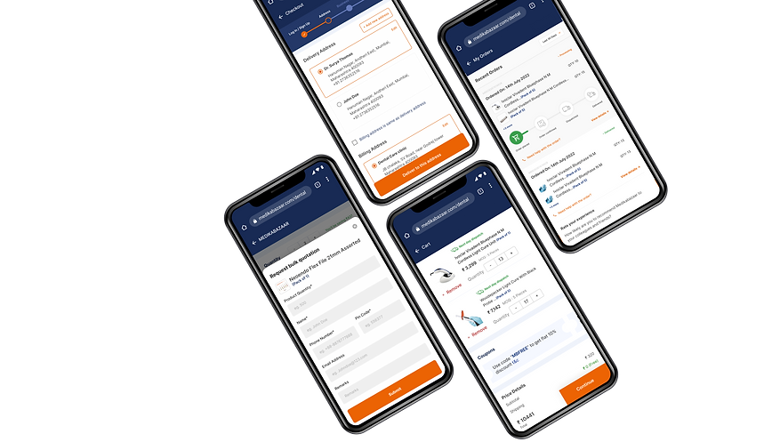
Seamless Checkout with Progress Bar

Checkout Stage Progress Bar
Users Frustration
44% Users often feel lost and anxious during checkout without a progress bar, unsure how many steps remain, which can lead to mistakes, delays, and abandoning their purchase.
Design Decision
-
Added a checkout stage progress bar to give users clear visibility of pending actions.
Design Impact
The checkout progress bar helps users see their steps clearly, reduces confusion, and encourages faster, more confident completion.
User’s Impact
19%
Reduction in checkout drop-offs due to clearer guidance
32%
Increase in independent user purchases
30%
Increased user confidence and satisfaction, measurable via post-purchase surveys
Business Impact
25%
increase in conversion rates when users find products faster
22%
increase in Average Order Value (AOV) as users explore more relevant products.
30%
higher customer satisfaction scores (CSAT) due to smoother discovery.